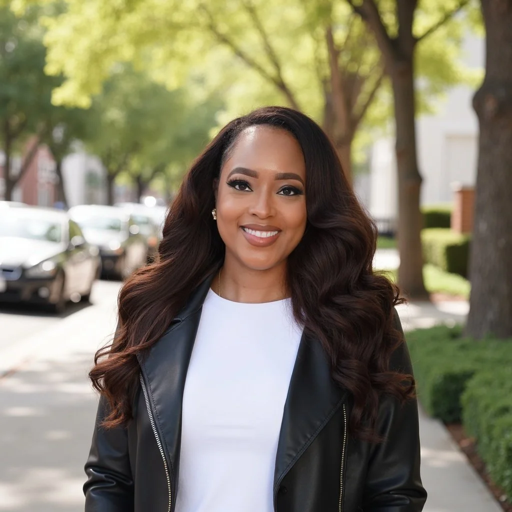
welcome to my corner.

Cari
Hawthorne.

est. always becoming

Notes I'm sitting with, books shaping my world, and a little coloring book I made just for you.

Cari Hawthorne
C
my little corner notes & thoughts what I'm reading discovering you coloring pages always becoming my little corner notes & thoughts what I'm reading discovering you coloring pages always becoming
Cari Hawthorne
Getting to Know Me

Hi, I'm Cari.

so glad you're here.

This is my little corner of the internet — no agenda, no brand, just me.

I write notes when something hits me. I share the books I'm living inside.

I'm not here to have it all figured out.
I'm here to show up honestly and share what I'm learning along the way.

Always mid-book (or three)
My dogs keep me grounded
Coloring is how I slow down
A creative — it shows in everything I do
Books Vinyl Creativity Intentional living Good conversations Slow mornings
Thoughts & Reflections

My Notes

the unfiltered stuff.

Things I'm thinking about, sitting with, and feeling called to write down.

March 2026
✦ Latest

Impostor Syndrome: What To Actually Do When It Shows Up

The preparation tool — how to close the space before doubt moves in and takes over the room.

Read →
March 2026
Mindset

Stop Measuring Your Inside Against Everyone's Outside

The comparison trap — what to do when the room makes it worse.

Read →
March 2026
Mindset

Keep Your Receipts

Building the evidence file — documenting your wins for yourself, not your resume.

Read →
Coming Soon
Mindset

Watch How You Talk About Yourself Out Loud

The language of shrinking — how to take credit without deflecting.

Read →
Coming Soon
Mindset

Who You Let In The Room With You Matters

Curating your circle — the people who quiet the doubt versus the ones who feed it.

Read →
Bookshelf

What I'm Reading

books that are changing me.
Currently Reading
The Daily
Stoic
Ryan Holiday
The Daily Stoic
Ryan Holiday
Progress64%
T
✓ Finished · Feb 2026
Think and Grow Rich
Napoleon Hill
★★★★★

A classic for a reason. The mindset chapters hit different when you're ready for them.

L
✓ Finished · Jan 2026
The Likeability Trap
Alicia Menendez
★★★★☆

Made me think about how I show up and who I'm performing for.

Free Downloads

Discovering You

a little book I made for you.

Each page is a pause, an invitation to sit with yourself. Download, print, color, keep it.

What colors are you naturally drawn to?
Page 01
How do you truly recharge?
Page 02
What are your sacred daily rituals?
Page 03
How do you truly show up for yourself?
Page 04
IDES ── */ html, body, #siteWrapper, #site, .Site, .Site-inner, #page, #content, #canvas, .canvas, main, article, section.page-section, .sqs-layout, .sqs-row, .sqs-block, .sqs-block-code, .sqs-block-code .sqs-block-content, .sqs-col-12, [data-block-type="code"], .content-wrapper, .view-list, .view-item, .page-section, .page-content, [id^="page-"], [class*="page-section"], .sqs-site-content, .entry-content, .container, .wrapper { padding: 0 !important; margin: 0 !important; max-width: 100% !important; width: 100% !important; } .sqs-block-code .sqs-block-content { overflow-x: hidden !important; } .sqs-layout > .sqs-row { padding: 0 !important; margin: 0 !important; } header, .Header, #header, nav.Header, header[data-controller], [data-controller="Header"], footer.Footer, footer#footer, .Footer, [data-controller="Footer"], #siteWrapper > footer, .site-footer, .squarespace-social-buttons, .sqs-announcement-bar { display: none !important; } html { margin: 0 !important; padding: 0 !important; overflow-x: hidden !important; } body { margin: 0 !important; padding: 0 !important; overflow-x: hidden !important; } :root { --teal: #1B5E52; --teal-deep: #134840; --teal-mid: #226B5E; --teal-light: #2E8272; --teal-muted: #3D7068; --warm-white: #FDFAF5; --ivory: #F8F3E8; --cream: #EDE5D4; --linen: #E2D8C4; --sand: #CFC0A0; --tan: #B8A882; --terra: #A8522A; --terra-light: #C4724A; --bark: #2C1F12; --charcoal: #1A1610; --warm-gray: #6B5E50; } *, *::before, *::after { box-sizing: border-box; margin: 0; padding: 0; } html { scroll-behavior: smooth; } body { background: var(--warm-white); color: var(--bark); font-family: 'Montserrat', sans-serif; overflow-x: hidden; width: 100%; } /* NUCLEAR TAKEOVER — fixed overlay escapes ALL Squarespace containers */ #ch-site { display: block; width: 100%; max-width: 100%; overflow-x: hidden; background: var(--warm-white); } /* ── NAV ── */ .ch-nav { position: fixed; top: 0; left: 0; right: 0; width: 100%; z-index: 9999; display: flex; align-items: center; justify-content: space-between; padding: 1rem 4rem; background: rgba(253,250,245,0.97); backdrop-filter: blur(12px); border-bottom: 1px solid rgba(27,94,82,0.1); } .ch-logo { font-family: 'Playfair Display', serif; font-size: 1.3rem; font-weight: 900; color: var(--bark); text-decoration: none; } .ch-logo em { font-style: italic; color: var(--teal); } .ch-nav-links { display: flex; gap: 2.2rem; list-style: none; align-items: center; } .ch-nav-links a { font-size: 0.58rem; letter-spacing: 0.22em; text-transform: uppercase; color: var(--warm-gray); text-decoration: none; font-weight: 600; transition: color 0.3s; } .ch-nav-links a:hover { color: var(--teal); } /* ── HERO ── */ .ch-hero { display: grid; grid-template-columns: minmax(0,1fr) minmax(0,1fr); min-height: 88vh; padding-top: 4rem; background: var(--ivory); overflow: hidden; width: 100%; } .ch-hero-left { display: flex; flex-direction: column; justify-content: center; padding: 3.5rem 3rem 3.5rem 5rem; position: relative; } .ch-hero-left::after { content: ''; position: absolute; right: 0; top: 15%; bottom: 15%; width: 1px; background: linear-gradient(to bottom, transparent, var(--linen) 30%, var(--linen) 70%, transparent); } .ch-eyebrow { font-family: 'Libre Baskerville', serif; font-size: 0.88rem; font-style: italic; letter-spacing: 0.06em; color: var(--warm-gray); opacity: 0.7; margin-bottom: 1rem; } .ch-headline { font-family: 'Playfair Display', serif; font-size: clamp(3rem, 5vw, 5.5rem); font-weight: 900; line-height: 0.95; color: var(--bark); letter-spacing: -0.02em; } .ch-headline em { font-style: italic; color: var(--teal); display: block; } .ch-rule { display: flex; align-items: center; gap: 1rem; margin: 1.6rem 0; } .ch-rule::before, .ch-rule::after { content: ''; flex: 1; height: 1px; background: var(--linen); } .ch-rule span { font-size: 0.44rem; letter-spacing: 0.32em; text-transform: uppercase; color: var(--sand); font-weight: 600; } .ch-hero-sub { font-family: 'Libre Baskerville', serif; font-size: 0.98rem; font-style: italic; line-height: 1.9; color: var(--warm-gray); max-width: 360px; margin-bottom: 2rem; } .ch-pills { display: flex; flex-wrap: wrap; gap: 0.6rem; } .ch-pill { font-size: 0.5rem; letter-spacing: 0.2em; text-transform: uppercase; font-weight: 600; padding: 0.55rem 1.2rem; border: 1px solid var(--linen); color: var(--warm-gray); text-decoration: none; transition: all 0.3s; } .ch-pill:hover { border-color: var(--teal); color: var(--teal); } .ch-pill.active { background: var(--teal); border-color: var(--teal); color: white; } /* Hero right photo */ .ch-hero-right { position: relative; overflow: hidden; background: var(--teal-deep); min-height: 500px; } .ch-hero-right img { width: 100%; height: 100%; object-fit: cover; object-position: center top; position: absolute; inset: 0; display: block; } .ch-hero-overlay { position: absolute; inset: 0; background: linear-gradient(to top, rgba(19,72,64,0.5) 0%, transparent 55%); z-index: 1; } .ch-hero-pattern { position: absolute; inset: 0; background-image: repeating-linear-gradient(40deg, rgba(255,255,255,0.02) 0px, rgba(255,255,255,0.02) 1px, transparent 1px, transparent 20px); z-index: 1; } .ch-photo-ph { width: 100%; height: 100%; min-height: 500px; background: var(--teal-deep); display: flex; flex-direction: column; align-items: center; justify-content: center; gap: 1rem; } .ch-photo-ph-ring { width: 100px; height: 100px; border-radius: 50%; border: 1px solid rgba(237,229,212,0.2); display: flex; align-items: center; justify-content: center; font-size: 3rem; } .ch-photo-ph p { font-family: 'Libre Baskerville', serif; font-size: 0.85rem; font-style: italic; color: rgba(237,229,212,0.35); text-align: center; max-width: 180px; line-height: 1.6; } .ch-hero-bg-letter { position: absolute; bottom: -3rem; right: -1rem; font-family: 'Playfair Display', serif; font-size: 18rem; font-weight: 900; font-style: italic; color: rgba(0,0,0,0.1); line-height: 1; pointer-events: none; user-select: none; z-index: 0; } /* ── TICKER ── */ .ch-ticker { background: var(--teal); padding: 0.75rem 0; overflow: hidden; white-space: nowrap; width: 100%; } .ch-ticker-track { display: inline-flex; animation: chticker 25s linear infinite; } .ch-ticker-item { font-size: 0.5rem; letter-spacing: 0.28em; text-transform: uppercase; color: rgba(237,229,212,0.75); font-weight: 600; padding: 0 2rem; display: inline-flex; align-items: center; gap: 2rem; } .ch-ticker-item::after { content: '✦'; color: var(--terra-light); font-size: 0.32rem; } @keyframes chticker { from{transform:translateX(0)} to{transform:translateX(-50%)} } /* ── SHARED ── */ .ch-section { padding: 4.5rem 5rem; width: 100%; box-sizing: border-box; } .ch-label { font-size: 0.5rem; letter-spacing: 0.35em; text-transform: uppercase; font-weight: 700; color: var(--terra); margin-bottom: 0.6rem; display: flex; align-items: center; gap: 1rem; } .ch-label::after { content: ''; flex: 0 0 2rem; height: 1px; background: var(--terra); opacity: 0.35; } .ch-title { font-family: 'Playfair Display', serif; font-size: clamp(1.9rem, 3vw, 2.8rem); font-weight: 900; line-height: 1.05; color: var(--bark); } .ch-title em { font-style: italic; color: var(--teal); } .ch-sub { font-family: 'Libre Baskerville', serif; font-size: 0.88rem; font-style: italic; letter-spacing: 0.06em; color: var(--warm-gray); opacity: 0.75; margin-top: 0.2rem; } .ch-desc { font-family: 'Libre Baskerville', serif; font-size: 0.98rem; font-style: italic; line-height: 1.9; color: var(--warm-gray); max-width: 480px; margin-top: 0.7rem; } .ch-hdr { margin-bottom: 3rem; } /* ── WHO I AM ── */ .ch-who { display: flex; flex-direction: row; background: var(--cream); width: 100%; min-height: 70vh; box-sizing: border-box; overflow: hidden; } .ch-who-photo { flex: 0 0 50%; max-width: 50%; } .ch-who-content-wrap { flex: 0 0 50%; max-width: 50%; box-sizing: border-box; overflow: hidden; } .ch-who-photo { position: relative; overflow: hidden; min-height: 480px; background: var(--teal-deep); max-width: 100%; } .ch-who-photo img { width: 100%; height: 100%; object-fit: cover; object-position: center top; position: absolute; inset: 0; display: block; } .ch-who-ov { position: absolute; inset: 0; background: linear-gradient(to bottom, transparent 50%, rgba(19,72,64,0.75)); z-index: 1; } .ch-who-tx { position: absolute; inset: 0; background-image: repeating-linear-gradient(-35deg, rgba(255,255,255,0.02) 0px, rgba(255,255,255,0.02) 1px, transparent 1px, transparent 22px); z-index: 1; } .ch-who-ph { position: absolute; inset: 0; display: flex; flex-direction: column; align-items: center; justify-content: center; z-index: 1; padding-bottom: 14rem; } .ch-who-ph-ring { width: 90px; height: 90px; border-radius: 50%; border: 1px solid rgba(237,229,212,0.2); display: flex; align-items: center; justify-content: center; font-size: 2.8rem; margin-bottom: 0.7rem; } .ch-who-ph p { font-family: 'Libre Baskerville', serif; font-size: 0.82rem; font-style: italic; color: rgba(237,229,212,0.3); text-align: center; } .ch-facts-strip { position: absolute; bottom: 0; left: 0; right: 0; z-index: 2; background: rgba(19,72,64,0.9); padding: 1.4rem 2rem; backdrop-filter: blur(6px); } .ch-facts-lbl { font-family: 'Libre Baskerville', serif; font-size: 0.76rem; font-style: italic; letter-spacing: 0.06em; color: rgba(237,229,212,0.42); margin-bottom: 0.6rem; } .ch-fact { font-family: 'Libre Baskerville', serif; font-size: 0.8rem; font-style: italic; color: rgba(237,229,212,0.68); padding: 0.22rem 0; line-height: 1.5; } .ch-who-content { padding: 3.5rem 3.5rem; display: flex; flex-direction: column; justify-content: center; min-width: 0; } .ch-who-body { font-family: 'Libre Baskerville', serif; font-size: 1rem; font-style: italic; color: var(--warm-gray); line-height: 1.95; margin: 1rem 0 1.5rem; word-wrap: break-word; overflow-wrap: break-word; } .ch-who-body strong { color: var(--bark); font-style: normal; font-weight: 700; } .ch-who-tags { display: flex; flex-wrap: wrap; gap: 0.45rem; } .ch-who-tag { font-size: 0.5rem; letter-spacing: 0.14em; text-transform: uppercase; font-weight: 600; padding: 0.35rem 0.85rem; border: 1px solid var(--linen); color: var(--warm-gray); transition: all 0.3s; } .ch-who-tag:hover { border-color: var(--teal); color: var(--teal); } /* ── NOTES ── */ .ch-notes { background: var(--ivory); overflow: hidden; } .ch-notes-grid { display: grid; grid-template-columns: repeat(3, minmax(0,1fr)); gap: 1.4rem; overflow: hidden; width: 100%; } .ch-note { background: var(--warm-white); padding: 2.2rem 1.8rem; border-bottom: 2px solid transparent; transition: transform 0.3s, box-shadow 0.3s, border-color 0.3s; cursor: pointer; } .ch-note:hover { transform: translateY(-4px); box-shadow: 0 12px 36px rgba(27,94,82,0.08); border-bottom-color: var(--teal); } .ch-note.feat { grid-column: span 2; background: var(--bark); border: none; border-left: 4px solid var(--terra); border-bottom: none; } .ch-note.feat:hover { box-shadow: 0 12px 36px rgba(0,0,0,0.18); border-left-color: var(--terra-light); } .ch-note.feat .ch-note-title { color: #fff; font-size: 1.6rem; } .ch-note.feat .ch-note-body { color: rgba(237,229,212,0.78); } .ch-note.feat .ch-note-date { color: var(--terra-light); } .ch-note.feat .ch-note-tag { background: rgba(168,82,42,0.22); color: var(--terra-light); } .ch-note.feat .ch-note-link { color: var(--sand); } .ch-note-date { font-size: 0.46rem; letter-spacing: 0.22em; text-transform: uppercase; color: var(--terra); font-weight: 600; margin-bottom: 0.7rem; } .ch-note-tag { display: inline-block; margin-bottom: 0.85rem; font-size: 0.44rem; letter-spacing: 0.16em; text-transform: uppercase; font-weight: 700; padding: 0.22rem 0.7rem; background: rgba(27,94,82,0.07); color: var(--teal); } .ch-note-title { font-family: 'Playfair Display', serif; font-size: 1.18rem; font-weight: 900; color: var(--bark); line-height: 1.2; margin-bottom: 0.8rem; overflow: hidden; word-wrap: break-word; } .ch-note-body { font-family: 'Libre Baskerville', serif; font-size: 0.9rem; font-style: italic; color: var(--warm-gray); line-height: 1.8; overflow: hidden; word-wrap: break-word; } .ch-note-link { display: inline-flex; align-items: center; gap: 0.4rem; margin-top: 1rem; font-size: 0.48rem; letter-spacing: 0.2em; text-transform: uppercase; color: var(--teal); font-weight: 700; text-decoration: none; transition: gap 0.3s; } .ch-note-link:hover { gap: 0.85rem; } /* ── READING — 2 books only ── */ .ch-reading { background: var(--cream); } .ch-reading-layout { display: grid; grid-template-columns: 190px 1fr; gap: 4.5rem; align-items: start; } .ch-reading-sticky { position: sticky; top: 5.5rem; } .ch-cr-badge { display: inline-flex; align-items: center; gap: 0.5rem; font-size: 0.48rem; letter-spacing: 0.22em; text-transform: uppercase; color: var(--teal); font-weight: 700; padding: 0.38rem 0.85rem; border: 1px solid rgba(27,94,82,0.25); margin-bottom: 1.2rem; } .ch-cr-badge::before { content: '●'; font-size: 0.36rem; animation: chblink 1.5s ease-in-out infinite; } @keyframes chblink { 0%,100%{opacity:1} 50%{opacity:0.15} } .ch-book-cover { width: 100%; aspect-ratio: 2/3; background: var(--teal-deep); display: flex; flex-direction: column; align-items: center; justify-content: center; position: relative; overflow: hidden; box-shadow: 7px 10px 28px rgba(27,94,82,0.2); margin-bottom: 1.1rem; } .ch-book-cover::before { content: ''; position: absolute; left: 0; top: 0; bottom: 0; width: 6px; background: rgba(0,0,0,0.2); } .ch-book-cover-rule { width: 1.8rem; height: 1px; background: rgba(168,82,42,0.5); margin-bottom: 0.9rem; } .ch-book-cover-title { font-family: 'Playfair Display', serif; font-size: 1rem; font-weight: 900; font-style: italic; color: rgba(237,229,212,0.9); text-align: center; padding: 0 1.4rem; line-height: 1.4; } .ch-book-cover-auth { font-family: 'Libre Baskerville', serif; font-size: 0.75rem; font-style: italic; color: rgba(237,229,212,0.35); margin-top: 0.8rem; } .ch-bk-name { font-family: 'Playfair Display', serif; font-size: 0.95rem; font-weight: 700; color: var(--bark); } .ch-bk-auth { font-family: 'Libre Baskerville', serif; font-size: 0.83rem; font-style: italic; color: var(--teal); margin-top: 0.15rem; } .ch-prog { margin-top: 0.85rem; } .ch-prog-row { display: flex; justify-content: space-between; font-size: 0.43rem; letter-spacing: 0.15em; text-transform: uppercase; color: var(--warm-gray); font-weight: 600; margin-bottom: 0.38rem; } .ch-prog-track { height: 2px; background: var(--linen); } .ch-prog-fill { height: 100%; background: var(--teal); } .ch-book-list { display: flex; flex-direction: column; } .ch-book-row { display: grid; grid-template-columns: 60px 1fr; gap: 1.2rem; padding: 1.5rem 0; border-bottom: 1px solid rgba(44,31,18,0.07); } .ch-book-row:first-child { padding-top: 0; } .ch-book-row:last-child { border-bottom: none; } .ch-book-mini { aspect-ratio: 2/3; display: flex; align-items: center; justify-content: center; position: relative; overflow: hidden; box-shadow: 3px 4px 10px rgba(27,94,82,0.15); } .ch-book-mini::before { content: ''; position: absolute; left: 0; top: 0; bottom: 0; width: 4px; background: rgba(0,0,0,0.15); } .ch-mini-letter { font-family: 'Playfair Display', serif; font-size: 1.3rem; font-weight: 900; font-style: italic; color: rgba(255,255,255,0.28); position: relative; z-index: 1; } .cb1 { background: #1B5E52; } .cb2 { background: #134840; } .ch-book-meta { display: flex; flex-direction: column; justify-content: center; } .ch-book-status { font-size: 0.44rem; letter-spacing: 0.18em; text-transform: uppercase; font-weight: 700; margin-bottom: 0.3rem; color: var(--teal); } .ch-book-name { font-family: 'Playfair Display', serif; font-size: 1rem; font-weight: 700; color: var(--bark); line-height: 1.2; margin-bottom: 0.18rem; } .ch-book-auth { font-family: 'Libre Baskerville', serif; font-size: 0.85rem; font-style: italic; color: var(--teal-light); margin-bottom: 0.45rem; } .ch-book-note { font-family: 'Libre Baskerville', serif; font-size: 0.88rem; font-style: italic; color: var(--warm-gray); line-height: 1.75; } .ch-book-stars { color: var(--terra); font-size: 0.62rem; margin-top: 0.3rem; } /* ── DISCOVERING YOU ── */ .ch-coloring { background: var(--bark); padding: 4.5rem 5rem; position: relative; overflow: hidden; width: 100%; } .ch-coloring::after { content: ''; position: absolute; inset: 0; background-image: repeating-linear-gradient(-40deg, rgba(237,229,212,0.02) 0px, rgba(237,229,212,0.02) 1px, transparent 1px, transparent 24px); pointer-events: none; } .ch-coloring .ch-label { color: var(--terra-light); position: relative; z-index: 2; } .ch-coloring .ch-label::after { background: var(--terra-light); } .ch-coloring .ch-title { color: var(--warm-white); position: relative; z-index: 2; } .ch-coloring .ch-title em { color: var(--sand); } .ch-coloring .ch-sub { color: rgba(207,192,160,0.5); position: relative; z-index: 2; } .ch-coloring .ch-desc { color: rgba(237,229,212,0.5); position: relative; z-index: 2; } .ch-coloring .ch-hdr { margin-bottom: 2.5rem; } .ch-pages-grid { display: grid; grid-template-columns: repeat(4, 1fr); gap: 1.3rem; position: relative; z-index: 2; } .ch-page-card { background: var(--warm-white); overflow: hidden; transition: transform 0.35s, box-shadow 0.35s; cursor: pointer; } .ch-page-card:hover { transform: translateY(-6px); box-shadow: 0 20px 48px rgba(0,0,0,0.28); } .ch-page-thumb { aspect-ratio: 3/4; background: #fefcf8; display: flex; align-items: center; justify-content: center; position: relative; overflow: hidden; } .ch-page-thumb svg { width: 80%; height: 80%; } .ch-page-overlay { position: absolute; inset: 0; background: rgba(27,94,82,0.82); display: flex; align-items: center; justify-content: center; opacity: 0; transition: opacity 0.3s; } .ch-page-card:hover .ch-page-overlay { opacity: 1; } .ch-dl-btn { font-family: 'Montserrat', sans-serif; font-size: 0.52rem; letter-spacing: 0.22em; text-transform: uppercase; font-weight: 700; padding: 0.7rem 1.4rem; background: var(--terra); color: white; border: none; cursor: pointer; text-decoration: none; display: inline-block; transition: background 0.3s; } .ch-dl-btn:hover { background: var(--terra-light); } .ch-page-info { padding: 0.6rem 0.8rem; } .ch-page-name { font-family: 'Playfair Display', serif; font-size: 0.78rem; font-weight: 700; color: var(--bark); line-height: 1.3; } .ch-page-sub { font-family: 'Libre Baskerville', serif; font-size: 0.65rem; font-style: italic; color: var(--teal-muted); margin-top: 0.15rem; opacity: 0.75; } .ch-coloring-note { text-align: center; margin-top: 2.5rem; position: relative; z-index: 2; } .ch-coloring-note p { font-family: 'Libre Baskerville', serif; font-size: 0.95rem; font-style: italic; color: rgba(237,229,212,0.38); } /* ── CONTACT ── */ .ch-contact { background: var(--teal); padding: 5rem 6rem; display: grid; grid-template-columns: minmax(0,380px) minmax(0,460px); gap: 5rem; align-items: center; width: 100%; box-sizing: border-box; overflow: hidden; justify-content: center; } .ch-contact-left h3 { font-family: 'Playfair Display', serif; font-size: 2.2rem; font-weight: 900; color: var(--warm-white); line-height: 1.1; } .ch-contact-left h3 em { font-style: italic; display: block; } .ch-contact-left p { font-family: 'Libre Baskerville', serif; font-size: 0.95rem; font-style: italic; color: rgba(253,250,245,0.55); margin-top: 0.7rem; line-height: 1.8; } .ch-form { display: flex; flex-direction: column; gap: 0.8rem; } .ch-form input, .ch-form textarea { padding: 0.88rem 1.2rem; background: rgba(253,250,245,0.1); border: 1px solid rgba(253,250,245,0.18); color: var(--warm-white); font-family: 'Montserrat', sans-serif; font-size: 0.75rem; outline: none; resize: none; transition: border-color 0.3s; width: 100%; box-sizing: border-box; } .ch-form input::placeholder, .ch-form textarea::placeholder { color: rgba(253,250,245,0.32); } .ch-form input:focus, .ch-form textarea:focus { border-color: rgba(253,250,245,0.48); } .ch-form textarea { min-height: 88px; } .ch-form-btn { font-family: 'Montserrat', sans-serif; font-size: 0.55rem; letter-spacing: 0.2em; text-transform: uppercase; font-weight: 700; padding: 0.88rem 2rem; background: var(--bark); color: var(--warm-white); border: none; cursor: pointer; transition: background 0.3s; align-self: flex-start; } .ch-form-btn:hover { background: var(--charcoal); } /* ── FOOTER ── */ .ch-footer { background: var(--charcoal); padding: 2.5rem 5rem; display: grid; grid-template-columns: 1fr auto 1fr; align-items: center; gap: 2rem; width: 100%; } .ch-footer-logo { font-family: 'Playfair Display', serif; font-size: 1.15rem; font-weight: 900; color: var(--sand); text-decoration: none; display: block; } .ch-footer-logo em { font-style: italic; color: var(--teal-light); } .ch-footer-tagline { font-family: 'Libre Baskerville', serif; font-size: 0.8rem; font-style: italic; color: rgba(207,192,160,0.28); margin-top: 0.2rem; } .ch-footer-vals { display: flex; flex-wrap: wrap; gap: 0.45rem; justify-content: center; } .ch-footer-val { font-size: 0.44rem; letter-spacing: 0.14em; text-transform: uppercase; font-weight: 600; padding: 0.28rem 0.65rem; border: 1px solid rgba(207,192,160,0.13); color: rgba(207,192,160,0.28); } .ch-footer-right { display: flex; flex-direction: column; align-items: flex-end; gap: 0.75rem; } .ch-footer-nav { display: flex; gap: 1.8rem; } .ch-footer-nav a { font-size: 0.48rem; letter-spacing: 0.16em; text-transform: uppercase; color: rgba(207,192,160,0.3); text-decoration: none; font-weight: 500; transition: color 0.3s; } .ch-footer-nav a:hover { color: var(--sand); } .ch-footer-yt { display: inline-flex; align-items: center; gap: 0.5rem; font-size: 0.48rem; letter-spacing: 0.16em; text-transform: uppercase; color: rgba(207,192,160,0.38); font-weight: 600; text-decoration: none; padding: 0.38rem 0.85rem; border: 1px solid rgba(207,192,160,0.16); transition: all 0.3s; } .ch-footer-yt:hover { color: #FF0000; border-color: rgba(255,0,0,0.4); } .ch-footer-yt svg { width: 13px; height: 13px; fill: currentColor; } .ch-footer-copy { font-size: 0.46rem; color: rgba(207,192,160,0.18); letter-spacing: 0.1em; } /* ── ANIMATIONS ── */ .fade-up { } /* ── OVERFLOW FIX — prevent all sections bleeding right ── */ #ch-site * { box-sizing: border-box; } #ch-site > *, .ch-hero, .ch-who, .ch-notes, .ch-reading, .ch-coloring, .ch-contact, .ch-footer, .ch-section, .ch-notes-grid, .ch-pages-grid, .ch-reading-layout, .ch-contact > *, .ch-footer > * { max-width: 100%; min-width: 0; } /* ── ICON BOXES ── */ .ch-icon-boxes { display: grid; grid-template-columns: 1fr 1fr; gap: 0.75rem; margin: 1.5rem 0; width: 100%; box-sizing: border-box; } .ch-icon-box { background: rgba(44,31,18,0.05); border: 1px solid var(--linen); padding: 1rem 1.1rem; display: flex; align-items: flex-start; gap: 0.75rem; } .ch-icon-box-icon { flex-shrink: 0; width: 20px; height: 20px; color: var(--teal); margin-top: 2px; } .ch-icon-box-icon svg { width: 100%; height: 100%; } .ch-icon-box-text { font-family: 'Libre Baskerville', serif; font-size: 0.82rem; font-style: italic; color: var(--warm-gray); line-height: 1.5; } /* ══════ MOBILE NAV HAMBURGER ══════ */ .ch-hamburger { display: none; flex-direction: column; gap: 5px; cursor: pointer; padding: 4px; background: none; border: none; z-index: 10001; } .ch-hamburger span { display: block; width: 22px; height: 2px; background: var(--bark); transition: all 0.3s; } .ch-mobile-menu { display: none; position: fixed; top: 0; left: 0; right: 0; bottom: 0; background: var(--ivory); z-index: 10000; flex-direction: column; align-items: center; justify-content: center; gap: 2.5rem; } .ch-mobile-menu.open { display: flex; } .ch-mobile-menu a { font-size: 0.75rem; letter-spacing: 0.3em; text-transform: uppercase; color: var(--bark); text-decoration: none; font-weight: 600; } .ch-mobile-menu .ch-close { position: absolute; top: 1.4rem; right: 1.4rem; font-size: 1.5rem; cursor: pointer; background: none; border: none; color: var(--bark); } /* ══════ MOBILE 768px ══════ */ @media (max-width: 768px) { #ch-site { overflow-x: hidden; } .ch-nav { padding: 0.9rem 1.4rem; } .ch-hamburger { display: flex; } .ch-nav-links { display: none; } .ch-logo { font-size: 1.1rem; } /* HERO */ .ch-hero { grid-template-columns: 1fr !important; min-height: auto; width: 100%; } .ch-hero-left { padding: 2.5rem 1.4rem 2rem; width: 100%; box-sizing: border-box; } .ch-hero-left::after { display: none; } .ch-headline { font-size: clamp(2.2rem, 10vw, 3rem); } .ch-hero-sub { font-size: 0.9rem; max-width: 100%; } .ch-hero-right { min-height: 260px; width: 100%; } .ch-photo-ph { min-height: 260px; } /* WHO I AM */ .ch-who { display: block !important; width: 100%; overflow: hidden; } .ch-who-photo { display: block !important; width: 100% !important; max-width: 100% !important; min-height: 320px; } .ch-who-content-wrap { display: block !important; width: 100% !important; max-width: 100% !important; box-sizing: border-box; overflow: visible; } .ch-who-content { padding: 2rem 1.4rem; width: 100%; max-width: 100%; box-sizing: border-box; overflow: visible; } .ch-who-title { font-size: clamp(1.8rem, 8vw, 2.4rem); } .ch-who-sub, .ch-who-body { font-size: 0.92rem; overflow-wrap: break-word; word-wrap: break-word; max-width: 100%; } .ch-icon-boxes { grid-template-columns: 1fr 1fr !important; gap: 0.6rem; } .ch-icon-box-text { overflow-wrap: break-word; font-size: 0.75rem; } .ch-who-tags { flex-wrap: wrap; } /* SECTIONS */ .ch-section { padding: 2.5rem 1.4rem; width: 100%; box-sizing: border-box; } .ch-desc { max-width: 100%; overflow-wrap: break-word; } .ch-title { overflow-wrap: break-word; } /* NOTES */ .ch-notes-grid { grid-template-columns: 1fr !important; } .ch-note.feat { grid-column: span 1 !important; } .ch-note.feat .ch-note-title { font-size: 1.2rem; } .ch-note-title { overflow-wrap: break-word; font-size: 1.1rem; } .ch-note-body { overflow-wrap: break-word; } /* READING */ .ch-reading-layout { grid-template-columns: 1fr !important; gap: 2rem; } .ch-reading-sticky { position: static; } .ch-book-cover { max-width: 140px; } .ch-book-row { grid-template-columns: 48px 1fr; gap: 0.8rem; } /* COLORING */ .ch-coloring { padding: 2.5rem 1.4rem; } .ch-pages-grid { grid-template-columns: repeat(2, 1fr) !important; gap: 0.8rem; } .ch-page-name { font-size: 0.7rem; } /* CONTACT */ .ch-contact { grid-template-columns: 1fr !important; gap: 1.5rem; padding: 2.5rem 1.4rem; } .ch-contact-left h3 { font-size: 1.6rem; } /* FOOTER */ .ch-footer { grid-template-columns: 1fr !important; text-align: center; padding: 2rem 1.4rem; gap: 1.2rem; } .ch-footer-right { align-items: center; } .ch-footer-nav { flex-wrap: wrap; justify-content: center; gap: 0.8rem; } } @media (max-width: 480px) { .ch-headline { font-size: clamp(1.9rem, 11vw, 2.5rem); } .ch-pages-grid { grid-template-columns: 1fr 1fr !important; gap: 0.6rem; } .ch-section { padding: 2rem 1.1rem; } .ch-coloring, .ch-contact { padding: 2rem 1.1rem; } .ch-footer { padding: 1.6rem 1.1rem; } } @media (max-width: 768px) { html, body { overflow-x: hidden !important; max-width: 100vw !important; } #ch-site, #ch-site * { max-width: 100% !important; box-sizing: border-box !important; } #ch-site { overflow-x: hidden !important; } .ch-who-content, .ch-who-body, .ch-who-title, .ch-who-sub { max-width: 100% !important; width: 100% !important; overflow-wrap: break-word !important; word-break: break-word !important; white-space: normal !important; } p, h1, h2, h3, h4, span, div { max-width: 100% !important; overflow-wrap: break-word !important; } }

Say
hello.

Have something on your mind? A thought, a question, just want to connect — I'd love to hear from you. No need to subscribe to anything, just say hi.